PROJECT
Logo Design & Foundational Brand System
Designed a logo and foundational brand direction for Building Bloc, a manufacturing technology startup focused on decentralized medical production. The project explored visual identity concepts that reflect modular systems, technological innovation, and the company’s mission to improve global access to essential healthcare supplies, establishing a strategic foundation for future brand expansion.

CLIENT STORY
A New Approach to Global Medical Manufacturing
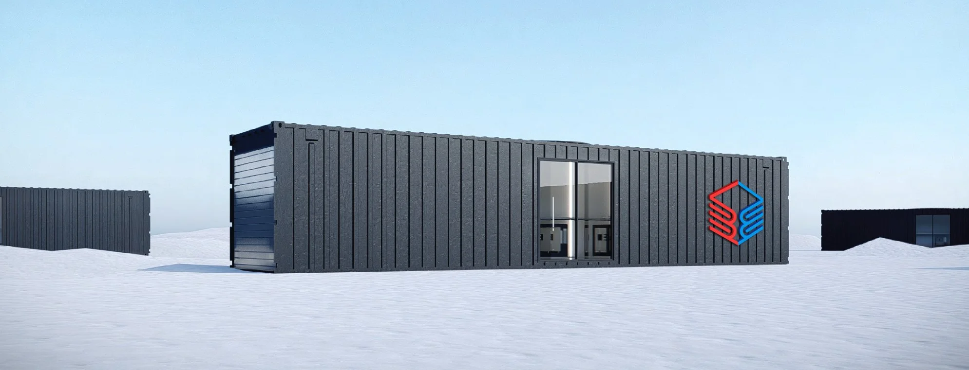
Building Bloc is a manufacturing technology startup transforming how healthcare consumables, medical devices, and replacement parts are produced and distributed. Their modular micro-factory system allows essential medical supplies to be manufactured on demand and deployed directly where they are needed most. With a bold mission but no established visual identity, the team needed a logo and brand foundation that could reflect their strength, innovation, and humanitarian impact, providing a scalable foundation for future brand applications.
STRATEGY
Defining The Brand Direction
The Challenge
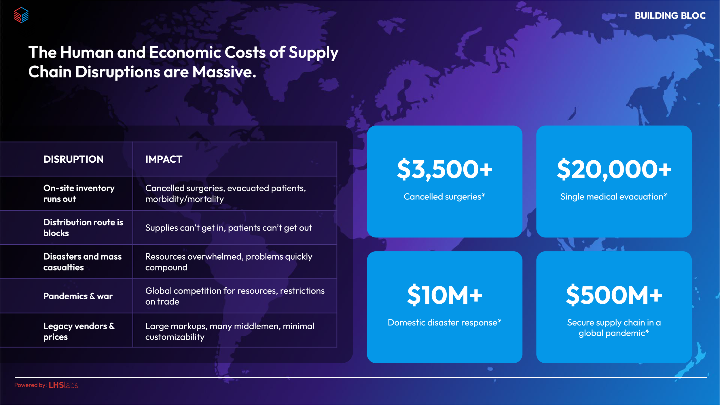
Building Bloc operates at the intersection of advanced digital manufacturing and healthcare. The challenge was translating this complex technology into a visual identity that felt clear, trustworthy, and mission-driven.
Key considerations included:
Communicating both technological innovation and human impact
Representing a system that is modular, scalable, and adaptable
Conveying strength, reliability, and precision in high-stakes medical environments
Ensuring the brand felt accessible and user-friendly, rather than overly technical or industrial
Brand Narrative Direction
The brand narrative centered around the idea of strength through modular innovation. Building Bloc’s technology enables critical medical supplies to be produced on demand through mobile micro-factories, creating a resilient and responsive manufacturing system.
The visual direction focused on communicating key attributes the team identified as essential to the brand: humanity, innovation, adaptability, and reliability. In addition, the brand voice draws inspiration from Captain America: human and approachable, mission-driven, supportive, disciplined, reliable, and guided by a strong moral compass. These qualities ensure the brand communicates with purpose, clarity, and trust, balancing precision and sophistication with accessibility.
By combining these attributes, the brand establishes Building Bloc as both a technological solution and a mission-driven organization working to improve global healthcare access, while providing a foundation for future brand systems and expansion.
“Bloc speaks to collaboration for a common cause, while also doubling as a singular component.”
IDENTITY
Defining The Brand Foundation
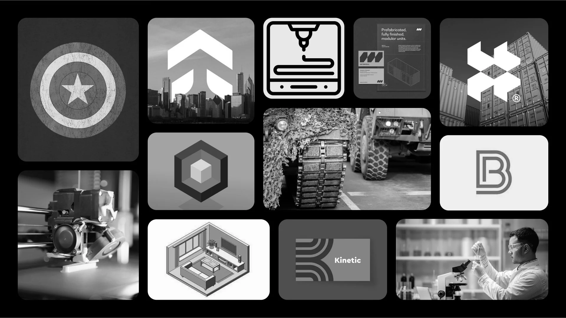
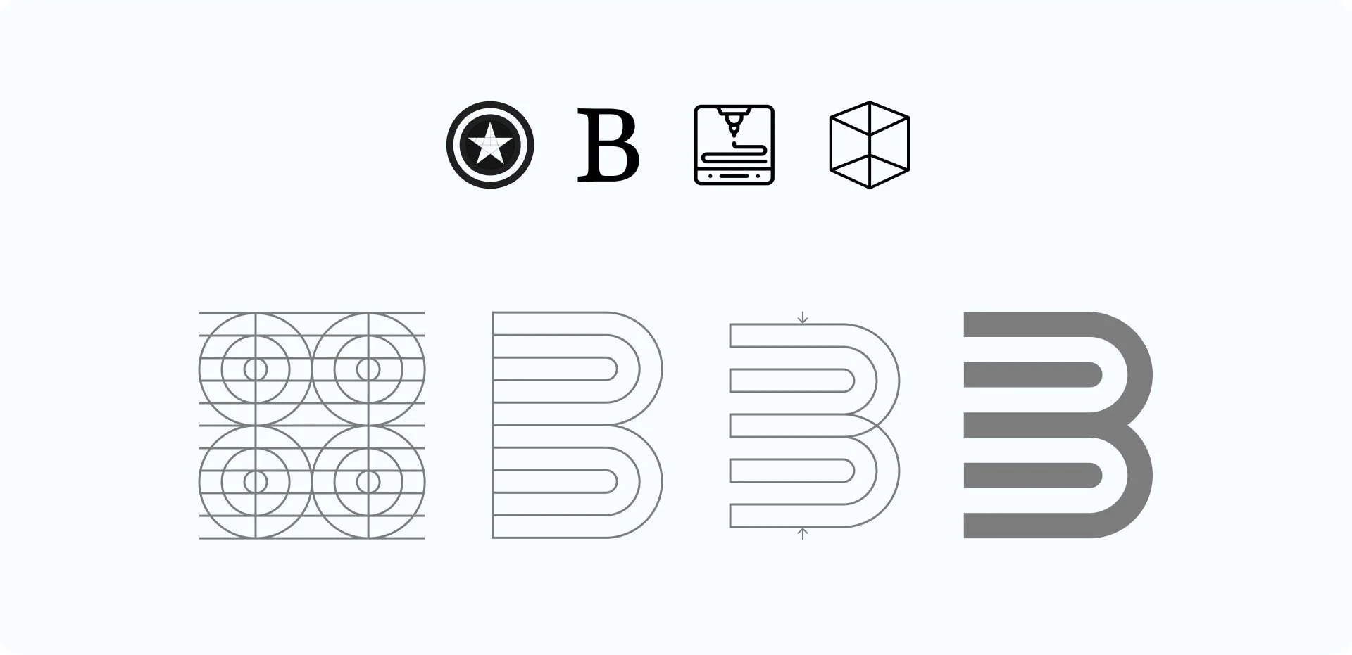
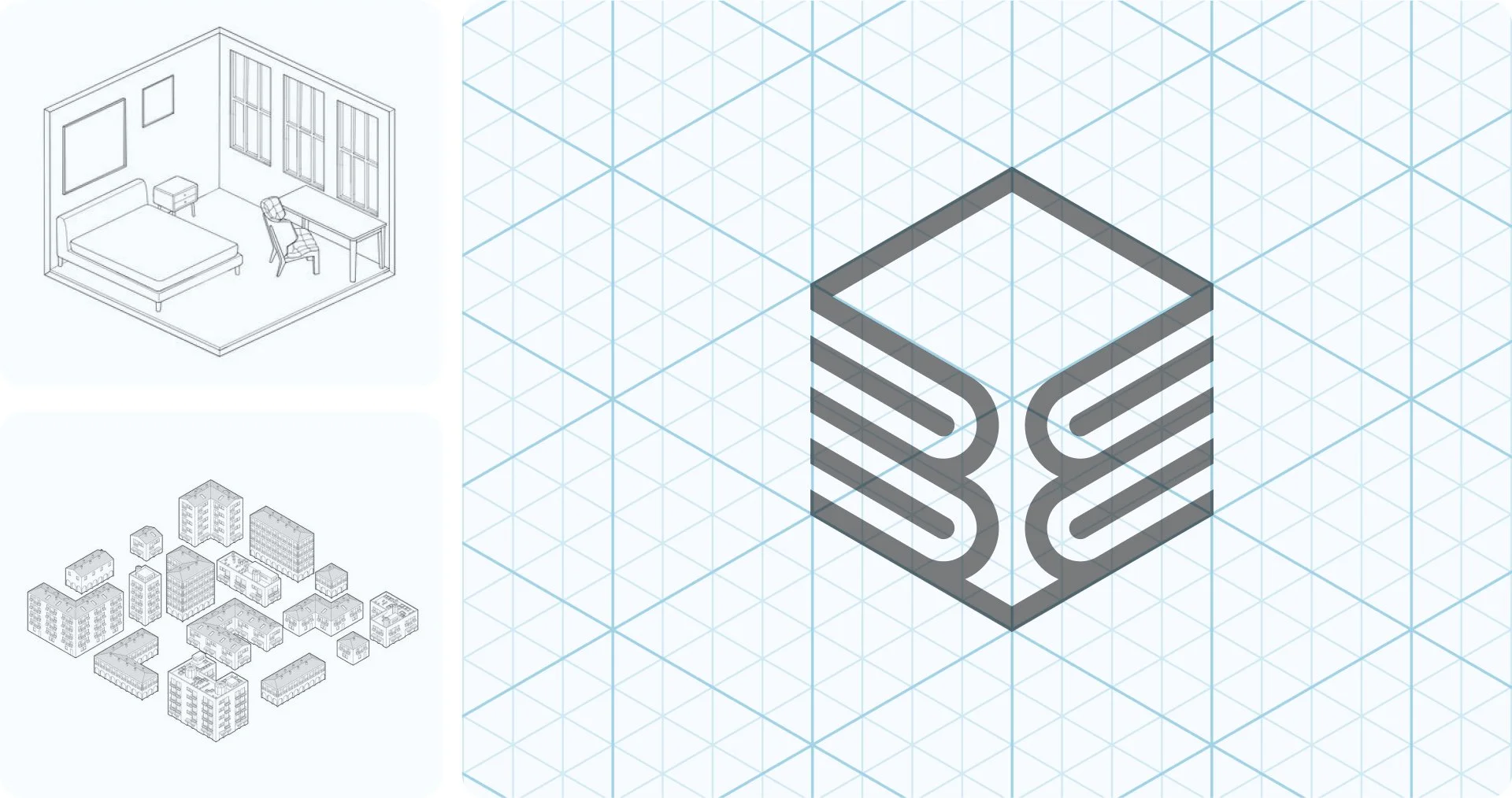
The name Building Bloc captures the idea of collaboration for a common cause while also referencing a singular, modular component—central to the brand’s concept. The challenge was to create a visual identity that reflects this modularity without feeling literal or toy-like. The final logo uses an isometric grid to evoke structure, precision, and adaptability, while the layered arcs within the “B” subtly nod to the circular geometry of Captain America’s shield, reinforcing strength and trust.
This approach balances technological sophistication with humanity, mirroring the company’s mission to provide reliable, on-demand medical manufacturing, while establishing a flexible visual system that can extend across future brand applications.
Visual Identity Development
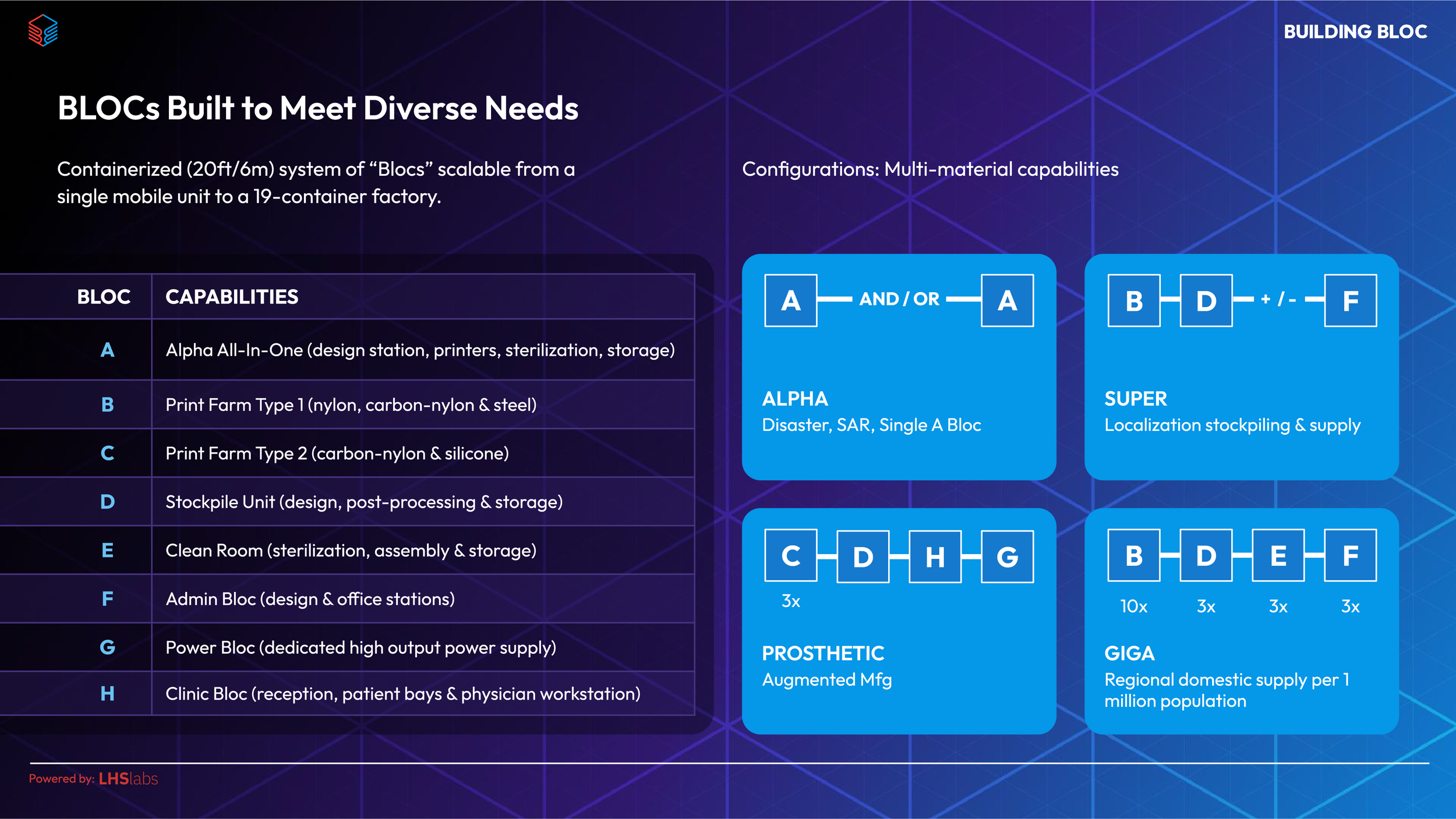
The visual identity for Building Bloc was developed as a cohesive system to reflect the brand’s core principles: modularity, adaptability, strength, and accessibility. Every design decision—from the logo to the colour palette and typography—was made to communicate both the technological sophistication of the microfactory system and the human, mission-driven impact of the brand. The system was designed to be flexible and scalable, capable of supporting future brand applications across digital interfaces, physical environments, and modular factory deployments.
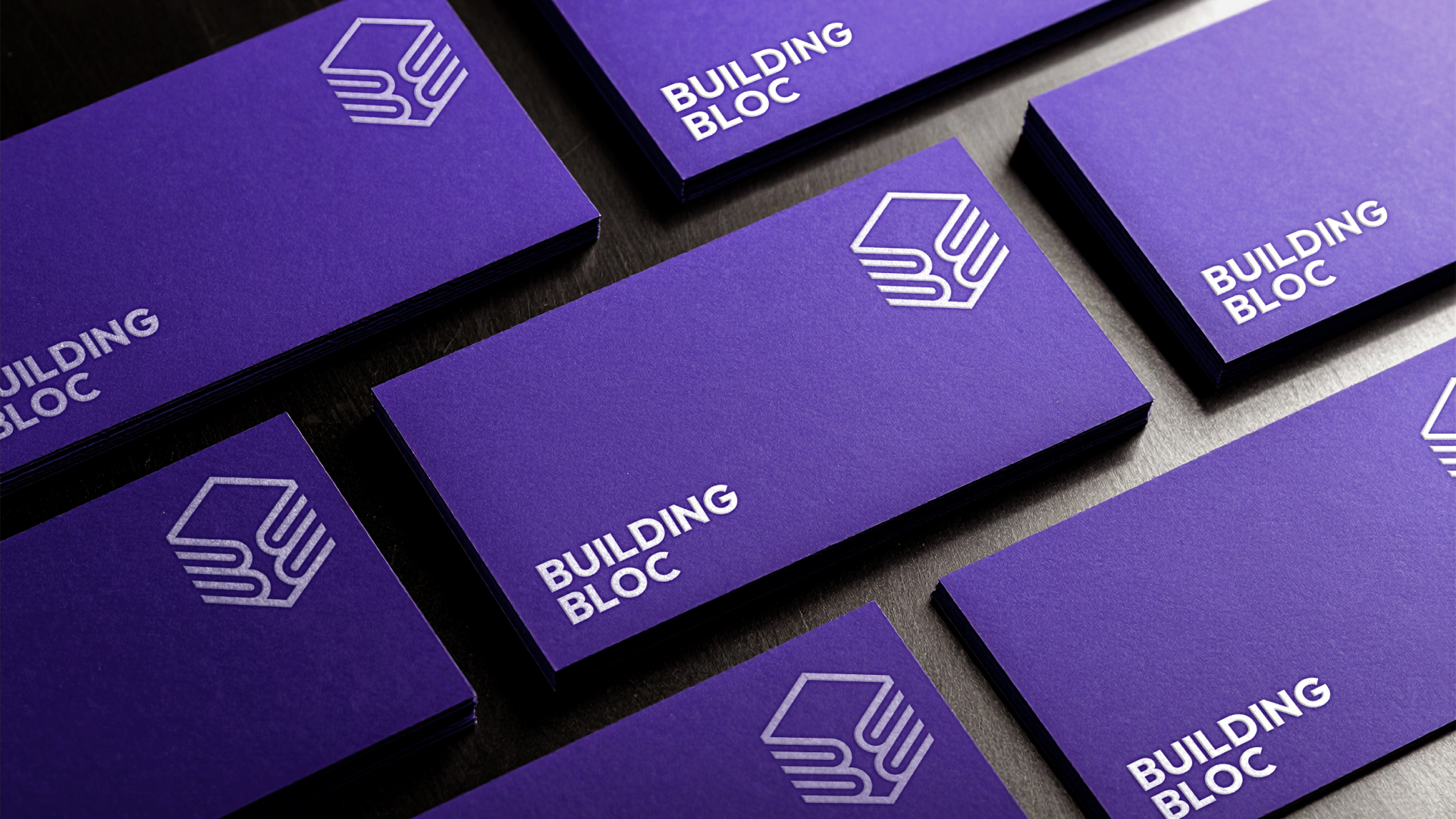
LOGO DESIGN
A Modular System Built For Clarity, Connection & Scalability
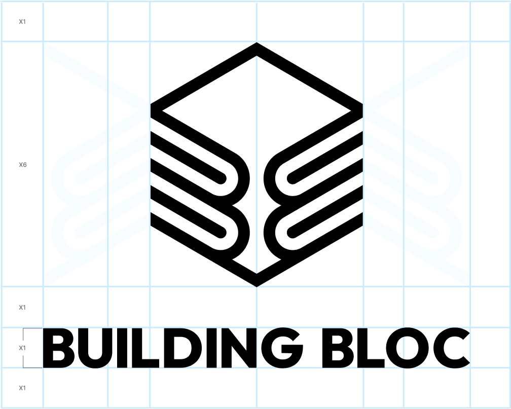
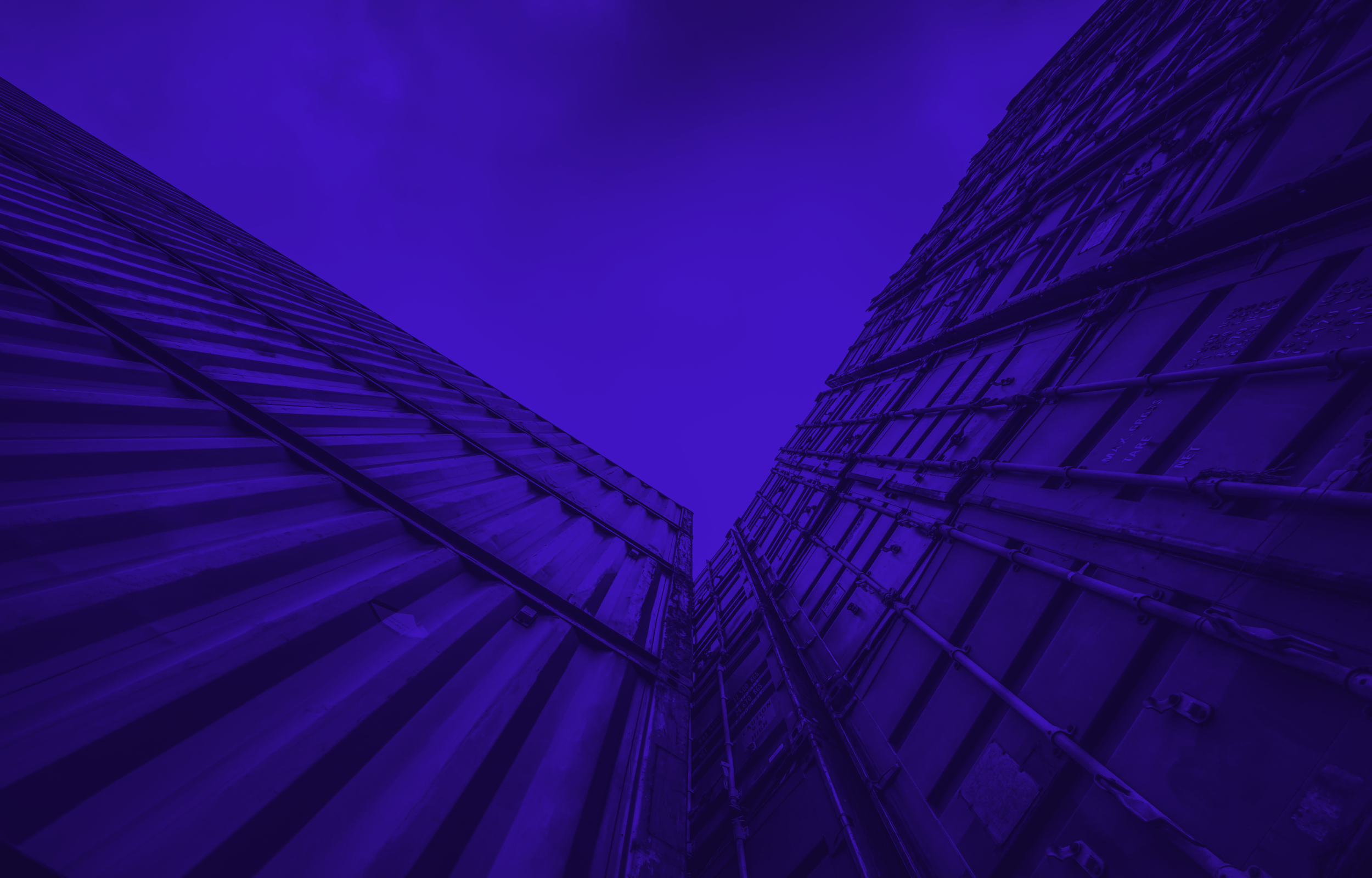
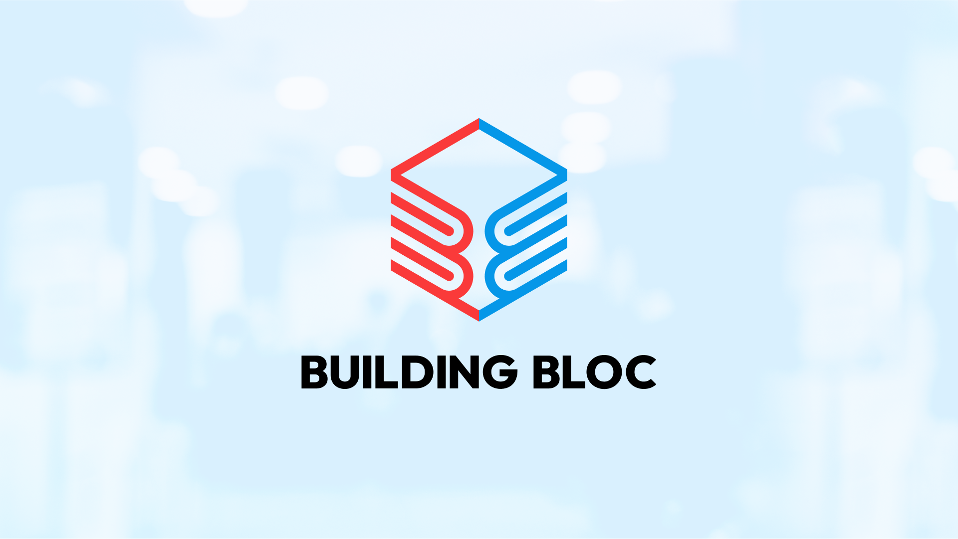
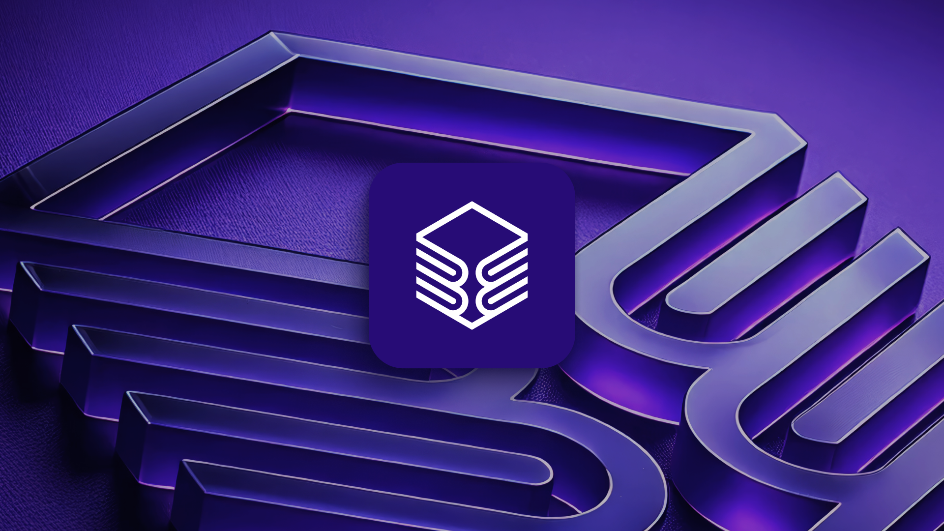
The Building Bloc logo was designed as a modular, multi-faceted system that communicates the brand’s core attributes: strength, adaptability, precision, and connectivity. Built on an isometric grid, the logo symbolizes structure and order, while its layered forms reflect the digital printing process used in microfactory manufacturing — each layer building on the last, forming corners and surfaces much like additive fabrication.
The design combines two inward-facing “Bs” to form a singular isometric block, representing the brand’s dual focus on medical and technological innovation. The circular geometry used to create the custom “B” shapes (inspired by the structure of Captain America’s shield) guided the layering and arcs, echoing the precision and repeatable structure of modular manufacturing.
This logo was intentionally designed to invite interpretation: some see a shield of strength, others see fingers sliding together to form a connection. Both readings reinforce the key principles underlying the brand — modularity, collaboration, and robustness. Like the rest of the visual identity, the logo functions as part of a flexible system, adaptable across applications while consistently reflecting Building Bloc’s human-centered, mission-driven, and scalable approach.
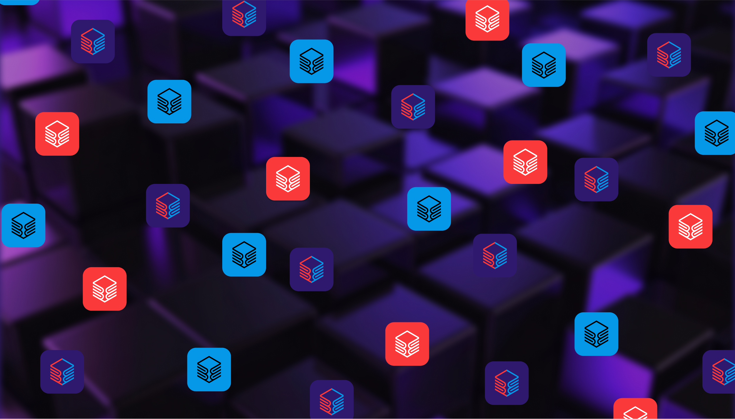
COLOUR BLOC
A Combination Of Colour Groups Sharing A Common Purpose.
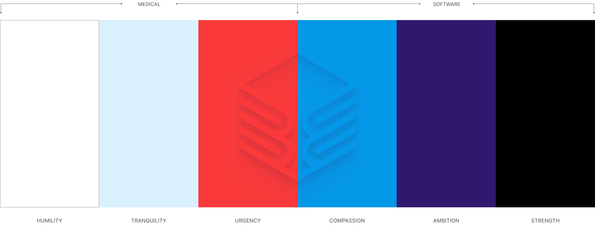
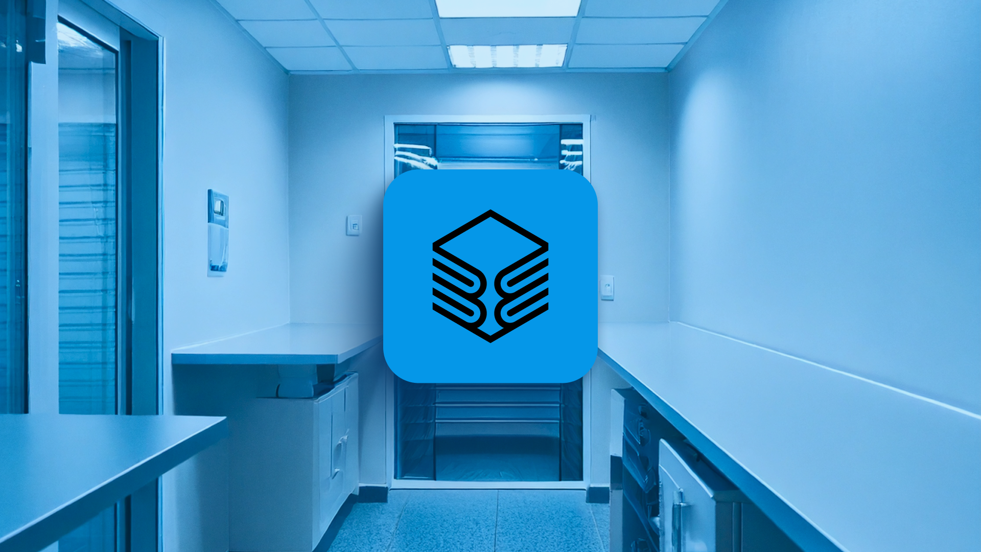
A dual-purpose palette was developed to reflect both the medical and technological aspects of Building Bloc. The clinical tones communicate trust, reliability, and the healthcare context, while the futuristic tones emphasize innovation and modular scalability. In addition, the palette is designed to feel accessible and user-friendly, supporting self-serve interactions within the microifactories, while also signaling medical urgency and reinforcing the conceptual connection to the Building Bloc name.
The two colour groups are led by red and blue. These colours are designed to have the same tonal value, and when converted to greyscale, they become the same shade of grey, visually uniting the two groups. Together, the colours symbolize the connection, adaptability, and scalability of the microfactory system, illustrating how multiple units can link to form a larger, flexible manufacturing network.
TYPOGRAPHY
A Typeface That Reflects Structure, Adaptability & Teamwork
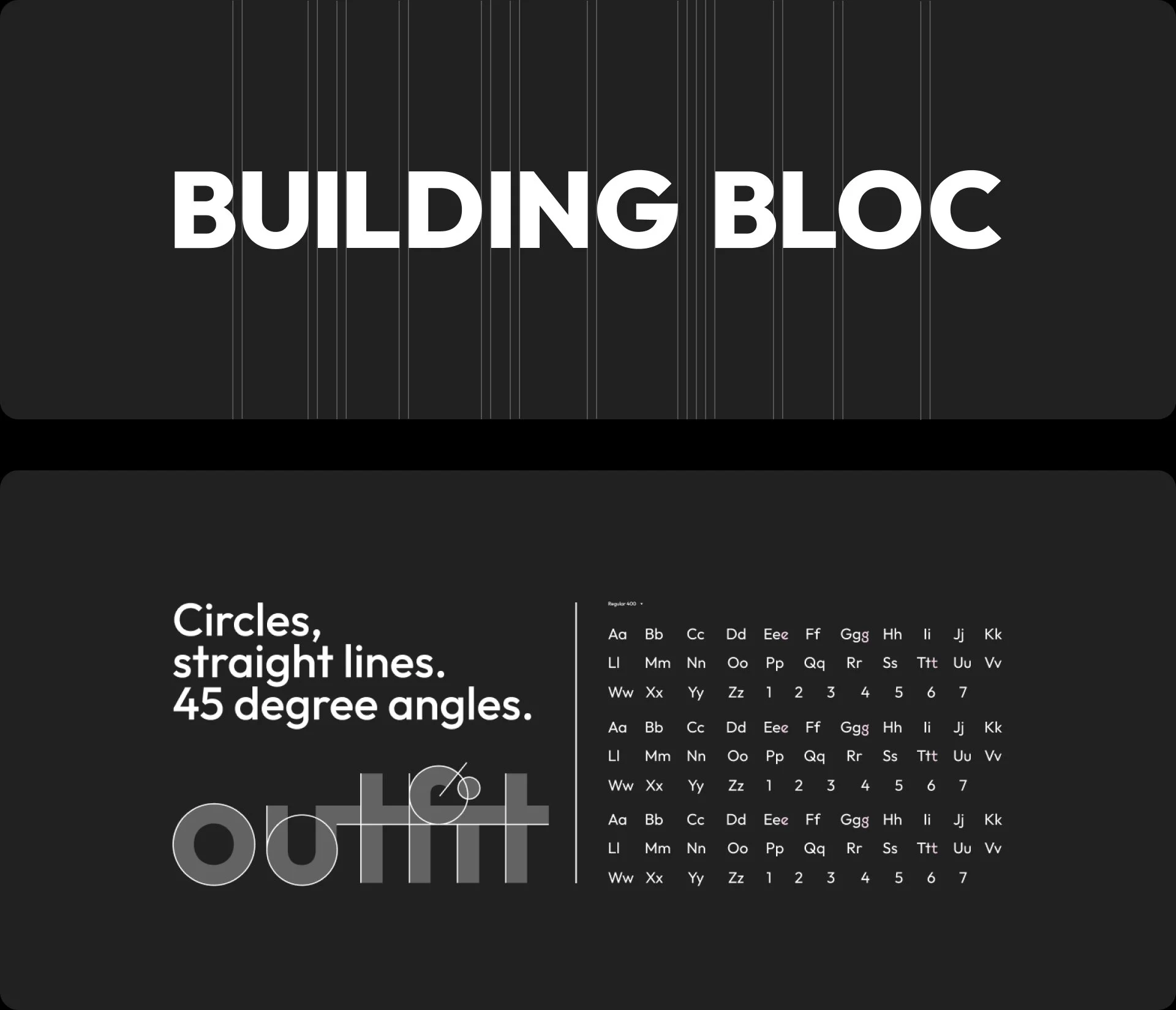
The geometric sans-serif typeface Outfit was chosen for its clean, modern structure and simple, rule-based construction, reflecting clarity and precision. Beyond its visual qualities, the name “Outfit” resonates conceptually: in addition to its typographic strength, it subtly references a group, organization, or unit — which aligns with Building Bloc’s modular microfactory system and its partnerships, including with the Canadian Forces. This connection reinforces the brand’s multifaceted applications, collaborative nature, and adaptable structure, reinforcing a forward-thinking yet approachable personality.
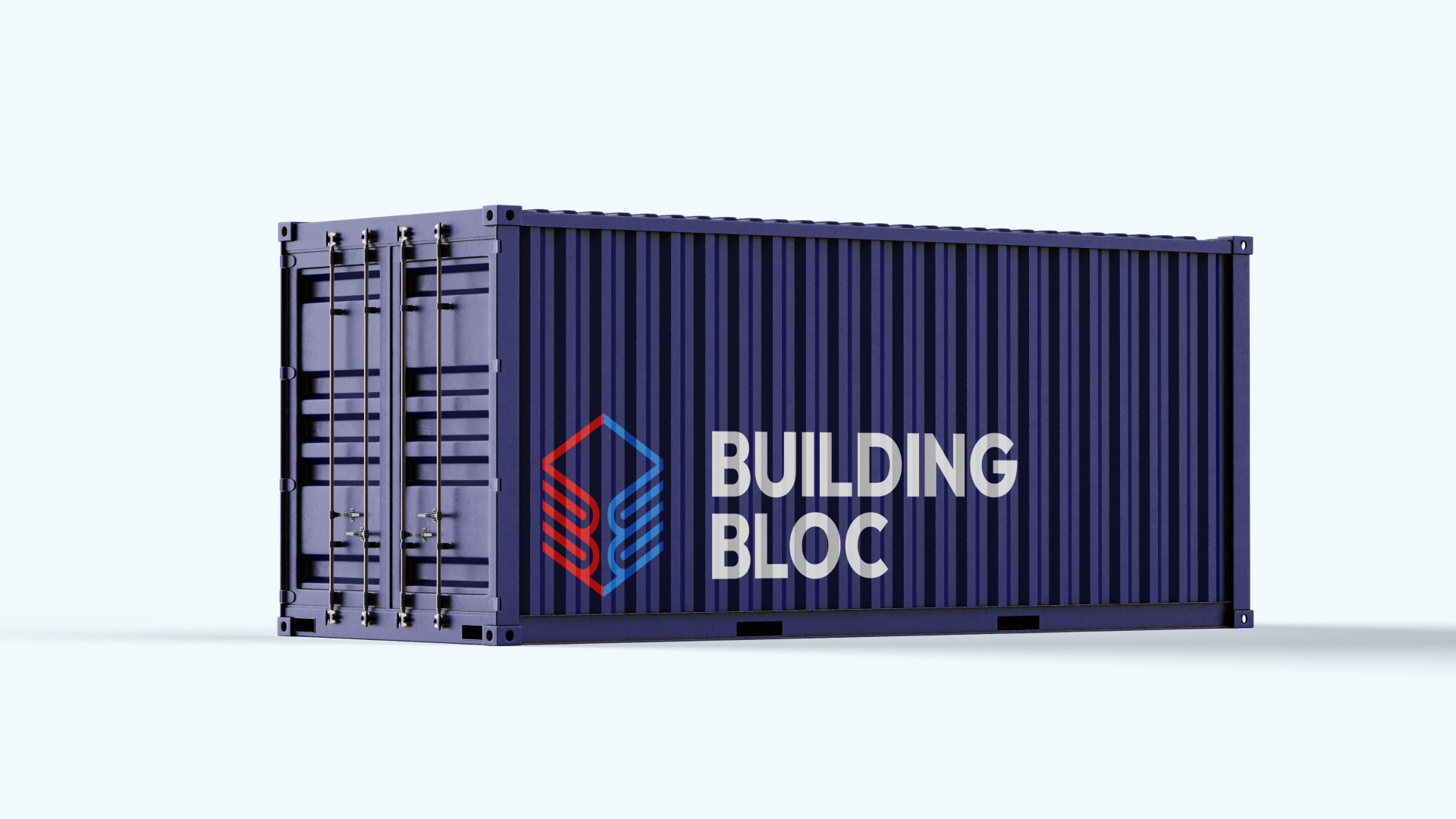
APPLICATION
Concepts for Future Expansion
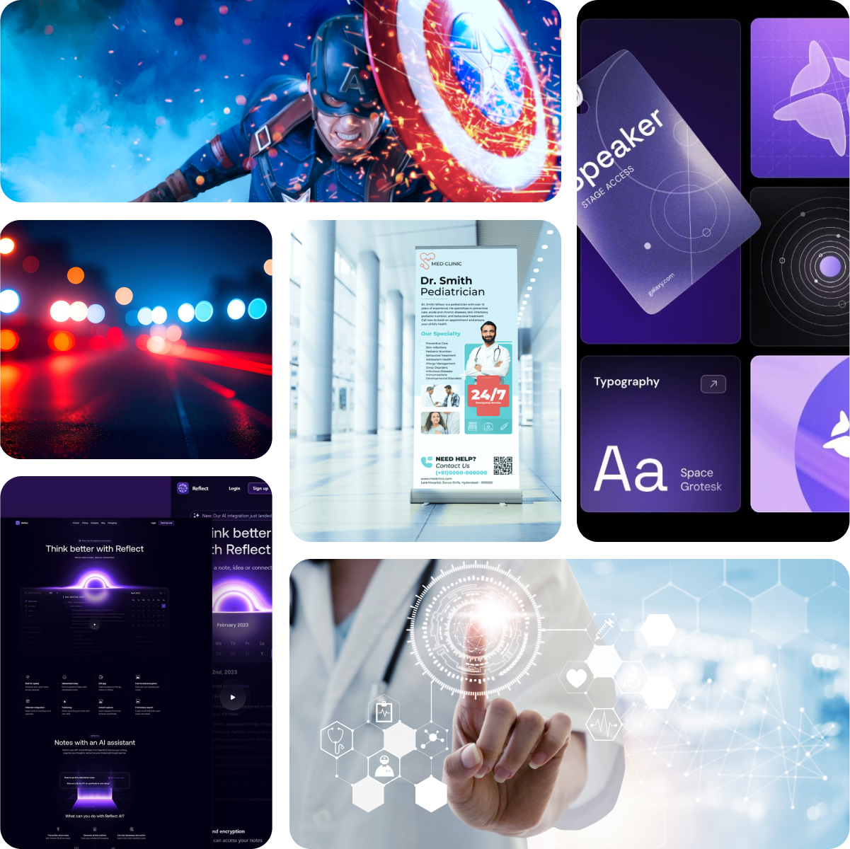
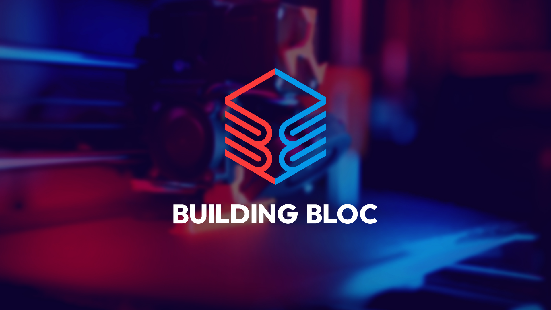
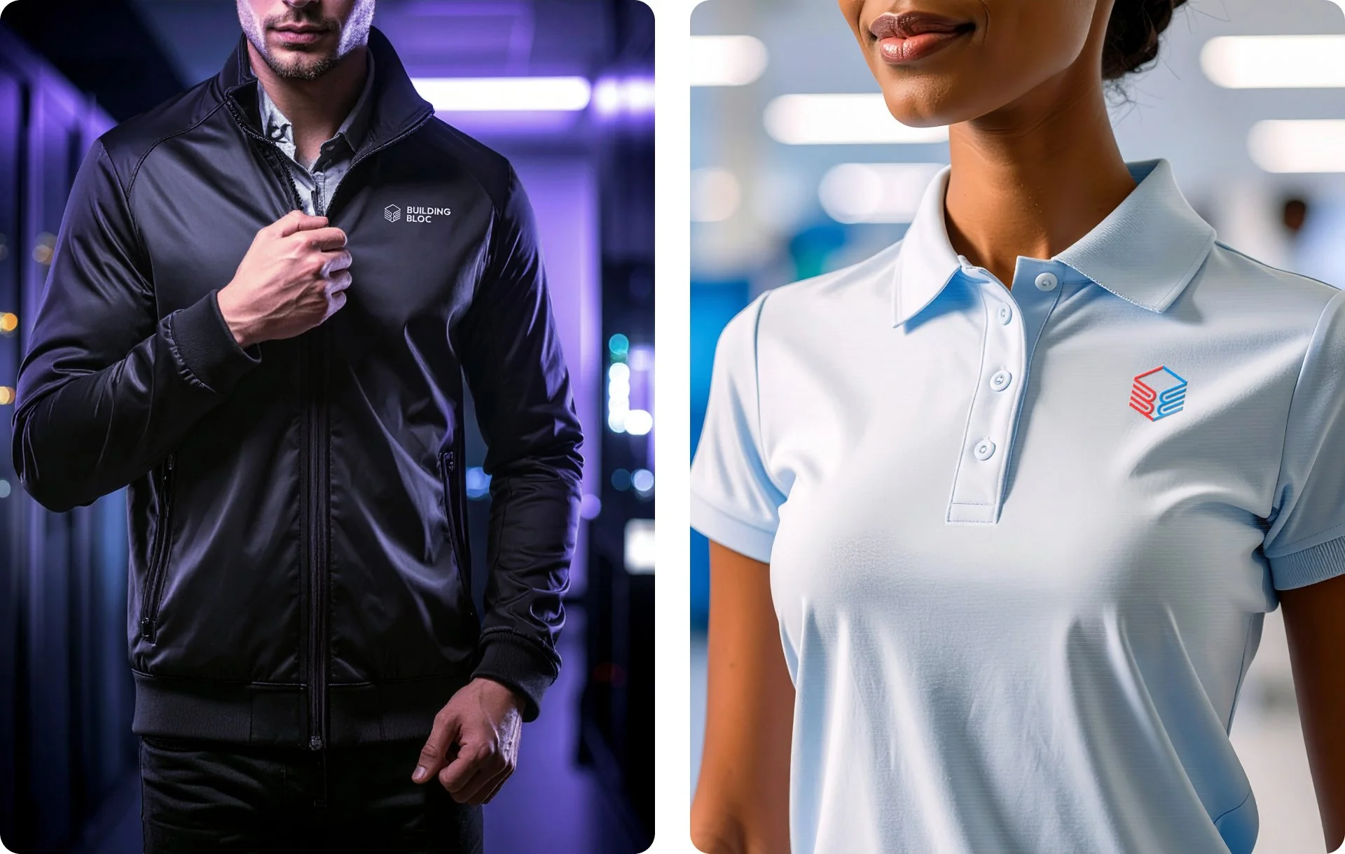
Although this project focused primarily on logo design, I explored a series of conceptual applications to demonstrate how the identity could function across future brand materials.
These explorations included merchandise, digital interfaces, and environmental graphics, helping visualize how the brand might appear in real-world contexts.
Through these mockups, the identity begins to reveal its versatility. In some applications the brand leans toward a clinical, medical aesthetic, while in others it embraces a sleek, futuristic technology tone.
These directions show how the identity could support a wide range of communications as the company develops.

Ready To Build Your Brand?
Through structured discovery, narrative strategy, and cohesive identity systems, I help new and evolving businesses clarify who they are and communicate it with confidence.