PROJECT
Starter Brand Identity & Digital Presence
Designed a modern logo and supporting brand assets for Spence Mechanical, a heavy‑duty mobile mechanic service. The work includes a custom logo, landing page design, and concept explorations for merchandise and identity applications, demonstrating a tailored approach that balances rugged utility with contemporary style.

CLIENT STORY
A Modern Identity For Mobile Mechanics
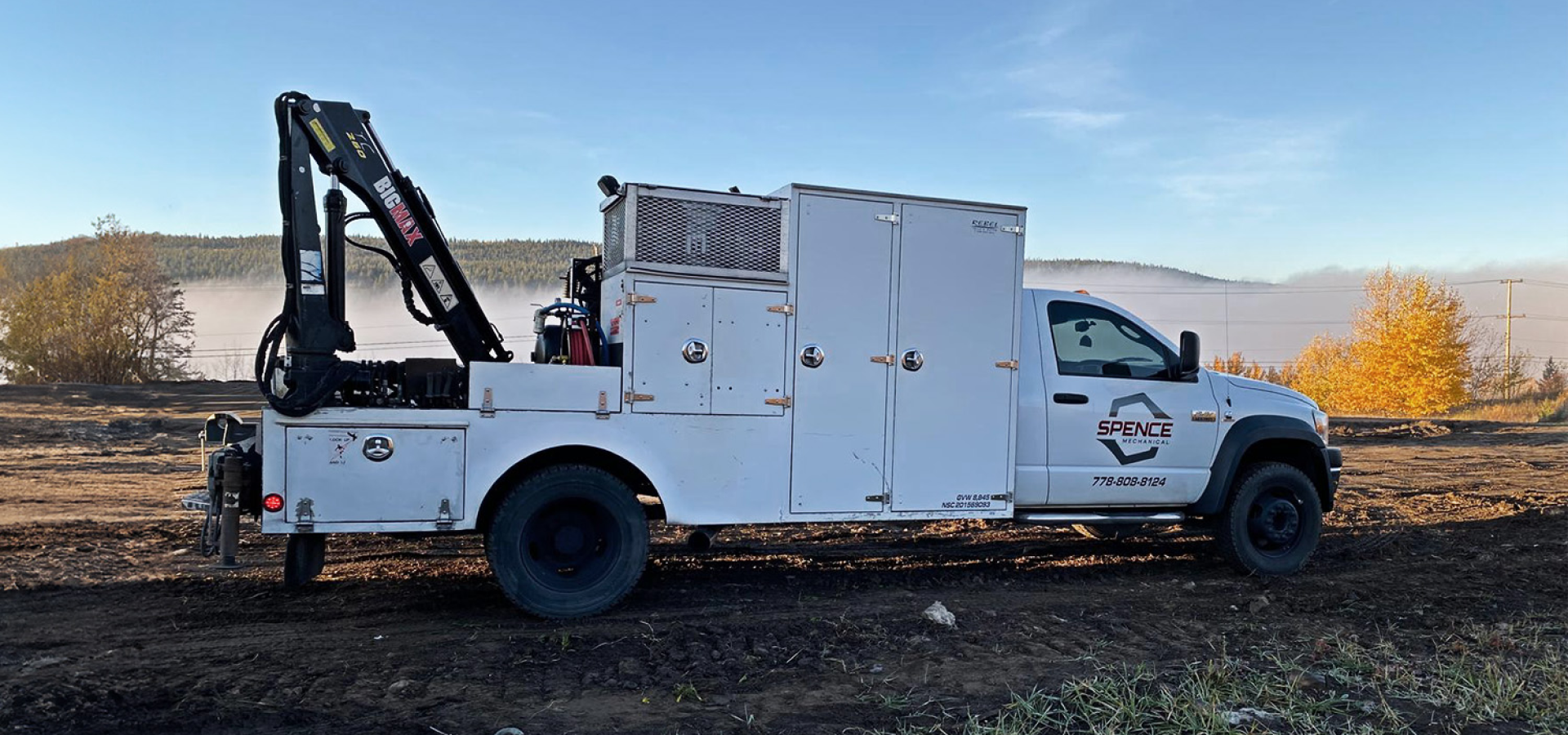
Spence Mechanical approached me for a logo and landing page that would reflect the company’s mobile, hands‑on service and no‑nonsense approach to equipment maintenance and repair. As a locally owned heavy‑duty mechanic service, the brand needed a visual identity that felt authentic to the trade while also projecting a modern and confident presence in digital and physical spaces.
STRATEGY
Defining The Brand Direction
The Challenge
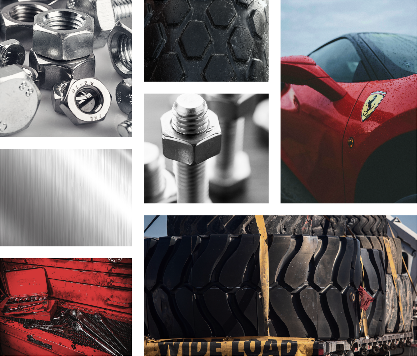
Crafting a brand for a mechanic service meant avoiding tired industry clichés like crossed wrenches or generic gears. Instead, the identity needed to feel modern, technical, and purposeful, while also translating easily across digital and merchandise contexts.
Key considerations included:
Developing a mark that feels authentic to mobile mechanical services
Creating visual elements inspired by tool geometry and motion
Ensuring the identity could support website, apparel, and promotional concepts
IDENTITY
Defining The Brand Foundation
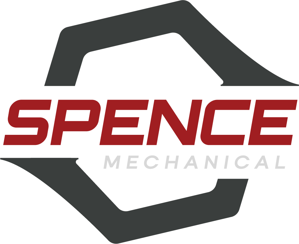
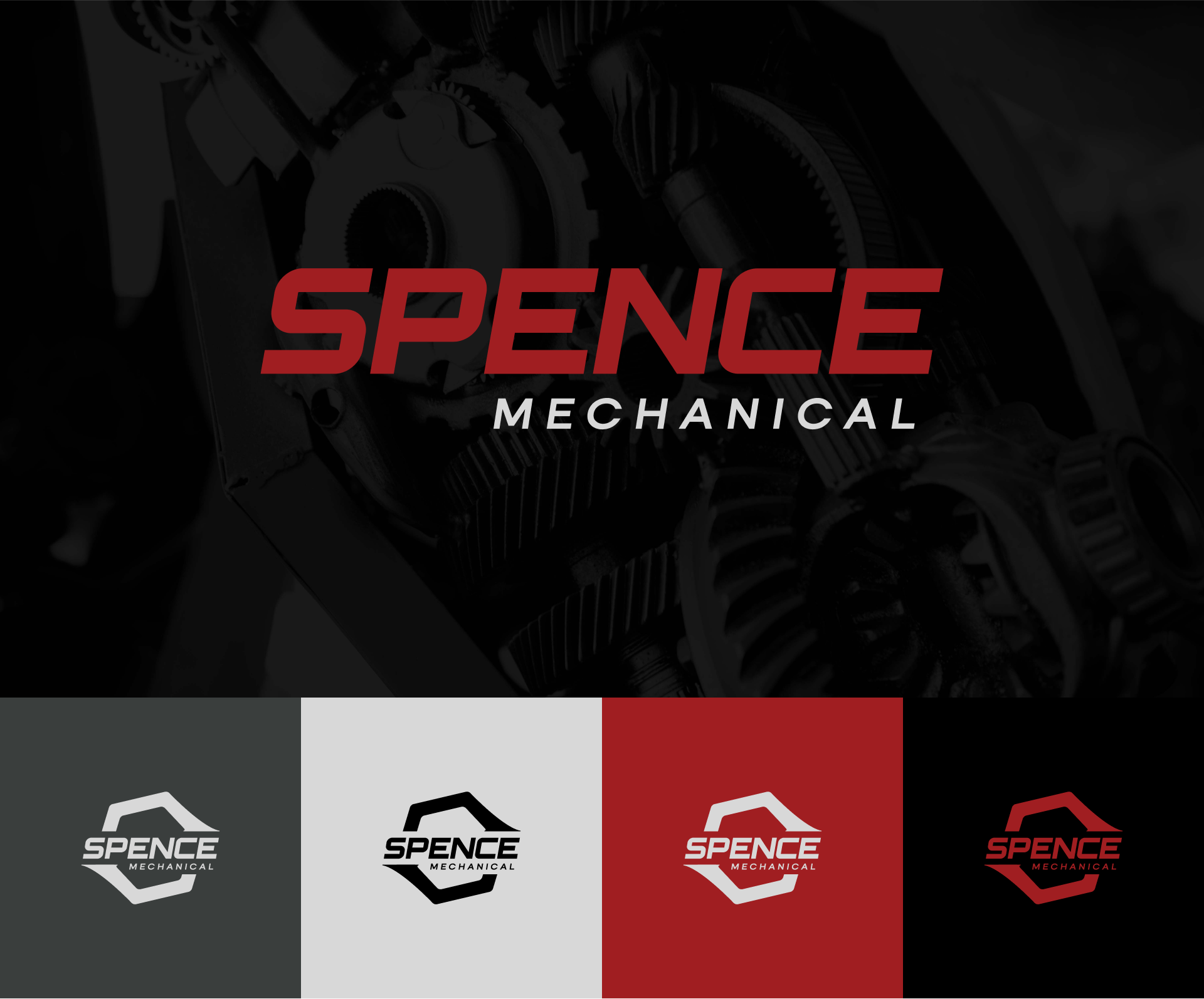
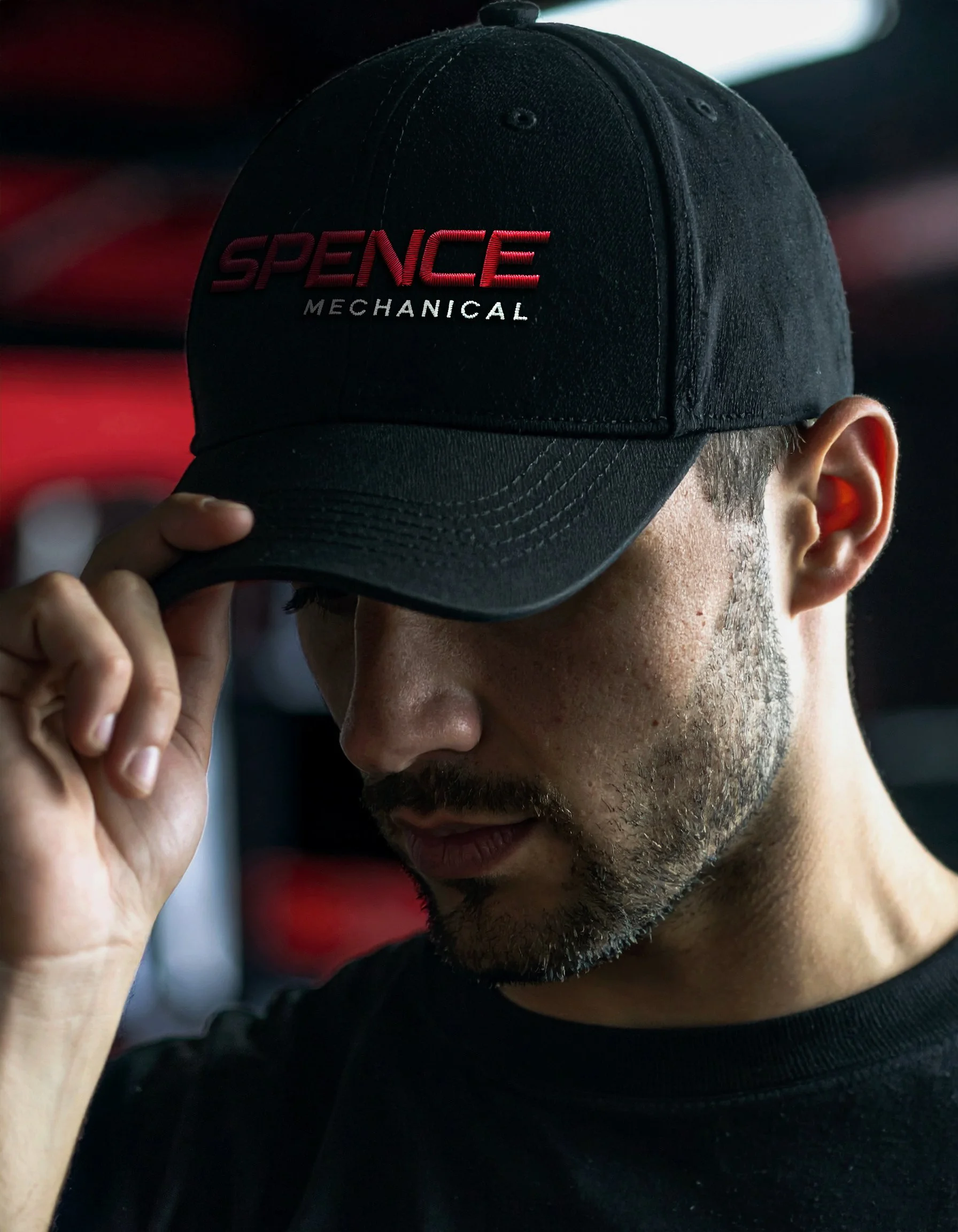
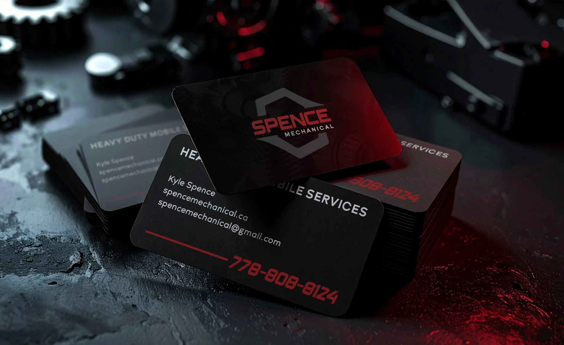
The foundation of the Spence Mechanical identity is a custom logo that draws on geometric forms found in tire treads, bolt heads, and wrench elements, giving it an industrial yet refined feel. Paired with a dynamic, slanted type, the mark conveys efficiency, movement, and reliability — qualities core to the client’s service and reputation.
Visual Identity Development
Logo: A custom symbol inspired by the geometry of tire treads and tools like bolts and the box-side of a wrench, balanced with a racing‑style slanted type to suggest speed and mobility.
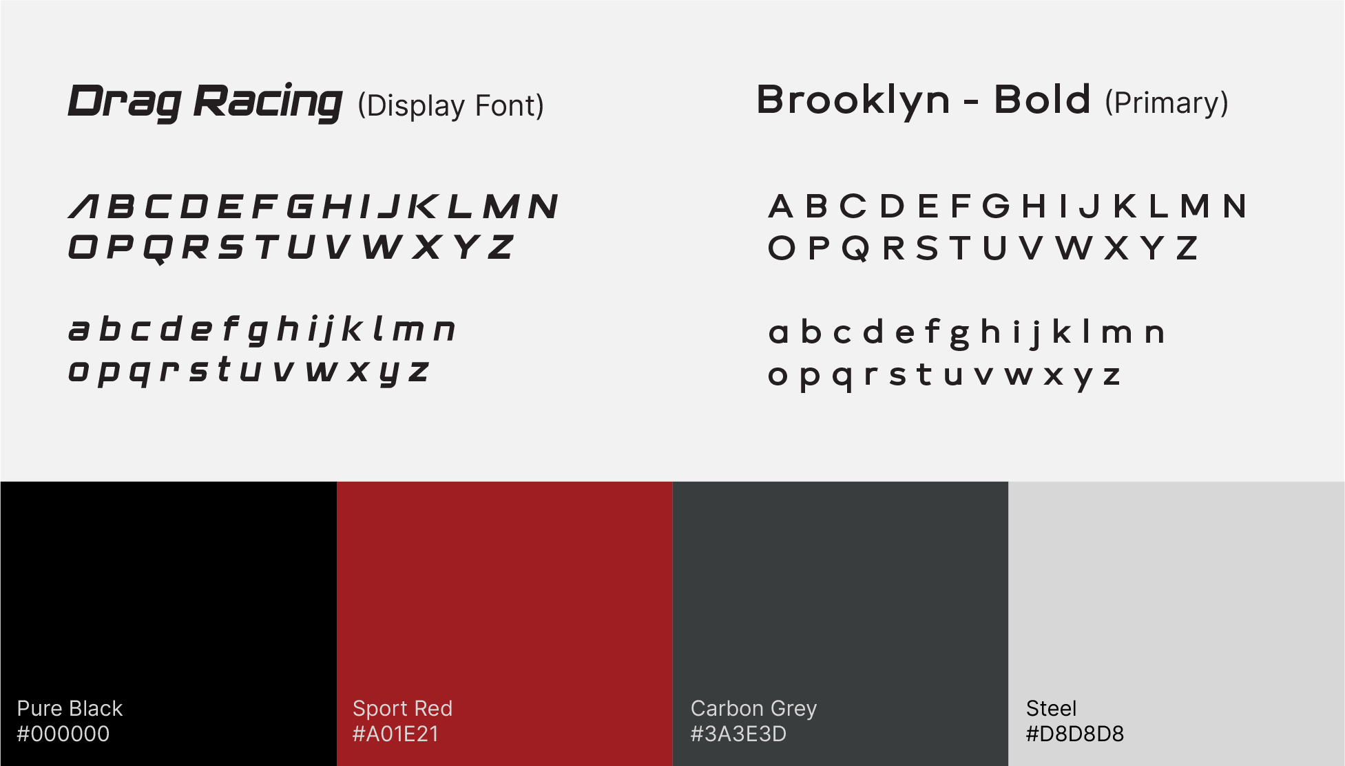
Color Palette: A bold, sport‑red primary paired with a strong neutral range that reinforces precision, energy, and professional strength.
Typography: Clean and modern type to support the angular graphic elements, ensuring clarity and legibility across web and merch environments.
FUTURE GROWTH
Exploring Brand Potential
Beyond the core logo and website, concept explorations show how the identity could extend from apparel to stationery. These mockups demonstrate the brand’s flexibility and potential for growth, providing a cohesive foundation that can evolve as Spence Mechanical expands its services or client base, ensuring the brand is recognizable across both digital and physical applications.

Ready To Build Your Brand?
Through structured discovery, narrative strategy, and cohesive identity systems, I help new and evolving businesses clarify who they are and communicate it with confidence.