Brand Identity
I had the opportunity to design a logo for Building Bloc, a manufacturing technology startup focused on revolutionizing how healthcare consumables and medical devices are produced and distributed. Using AI-driven systems and modular microfactories housed in shipping containers, Building Bloc aims to deliver on-demand medical supplies to underserved areas, including disaster zones, remote communities, and regions undergoing post-conflict recovery. The new logo was developed to reflect their forward-thinking approach, commitment to accessibility, and the adaptability of their innovative production model.

Image rendered by: Synthia JahanFreelance Designer
In designing the Building Bloc logo, I focused on qualities that really connected with their mission and values. The company is doing something new and ambitious, working at the intersection of manufacturing technology and humanitarian aid, so turning that into a clear visual identity took some thought.
During our initial conversations, I listened closely to the language the team used and took note of recurring themes and keywords that reflected their vision. They didn’t have a branding direction yet, but knew they wanted the voice and tone to resemble the personality of Captain America as many members of the Building Bloc team are big Marvel fans.
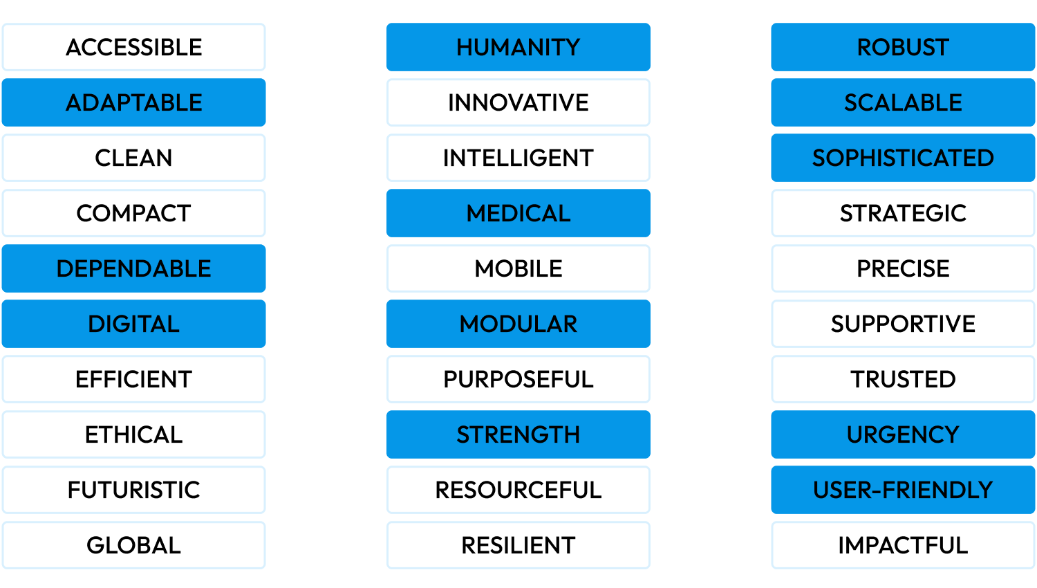
The checked keywords are the traits I chose to highlight in the design. They helped guide the creative direction and kept things focused while still leaving room for the big vision behind the company.
Ideation & Discovery
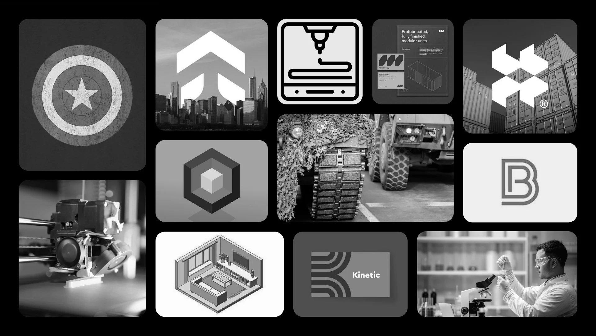
I started by gathering imagery, symbols, and graphics that I felt represented some of the key words and themes discussed. Some of the things that stood out were the trusting, humble tone of Captain America, the strength of military-inspired design, and the precision of digital printing technologies. These helped guide the overall direction, but the challenge was how to incorporate them without leaning too heavily into any one theme.
The name Building Bloc naturally brought to mind structural and modular concepts, but I found it tricky to move beyond the obvious use of a block. I wanted to explore ideas that reflected the company’s mission in a more abstract way, while still communicating strength, adaptability, and purpose.
Development
When developing the logo, I wanted to create something original that didn’t rely on obvious or overused visuals. After looking into existing “BB” and block-style logos, I realized the name Building Bloc could easily come across like a construction company or even a toy brand. So I set out to design something that felt intentional, smart, and unique.
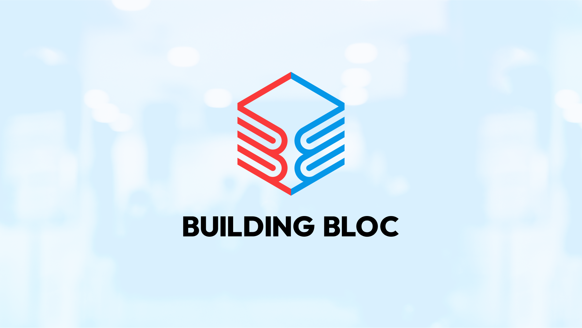
I started with an isometric grid, which helped capture a few of the key ideas right away: scalability, modularity, and adaptability. From there, I focused on building the letter “B” in a way that tied into the brand’s tone and mission. I drew inspiration from the circular forms in Captain America's shield to reference the brand voice, that created the arcs within the “B,” echoing both strength and trust.
To bring in the digital manufacturing side, I used those arcs to suggest the layering process of 3D printing. That gave the letter a sense of dimension and abstraction. I then mirrored the “B” to show two forms coming together, and used that structure to create the right and left faces of a cube. Adding the top outline completed the shape and pulled everything into a unified mark.


Typography
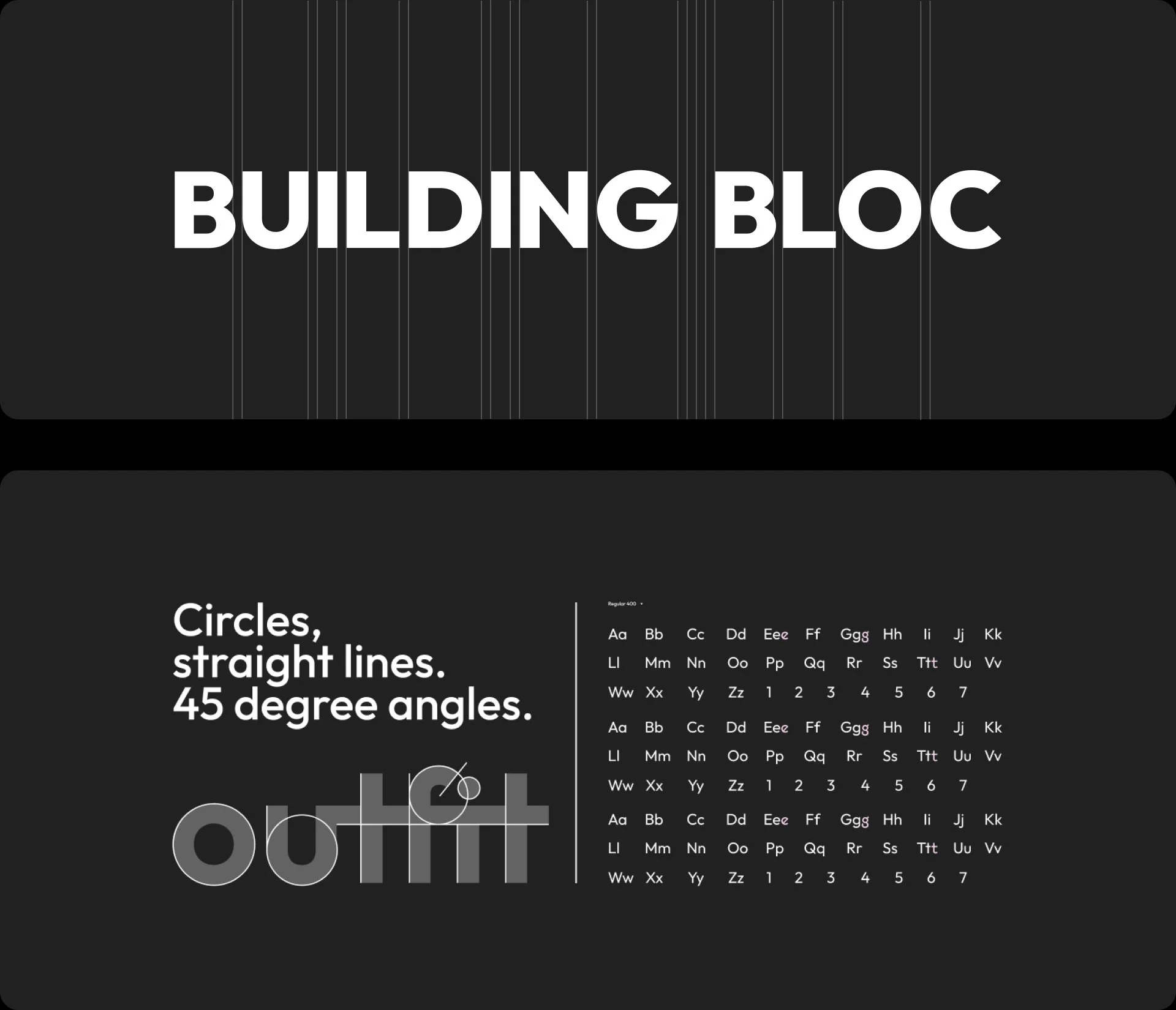
Google Font: Outfit - ExtraBold
For the brand typeface, I chose Outfit, a geometric sans-serif from Google Fonts. Visually, it’s strong, clean, and modern, qualities that match the technical, modular nature of Building Bloc’s work. It pairs well with the logo and supports a system that’s adaptable across both digital and physical applications.
Beyond its appearance, the name Outfit adds another layer of meaning. Defined as a team, unit, or organization, it reflects the company’s mission and ties into the meaning of bloc, a group working together toward a common goal. That connection reinforces key values at the heart of the brand: humanity, strength, dependability, and a robust, purpose-driven presence.

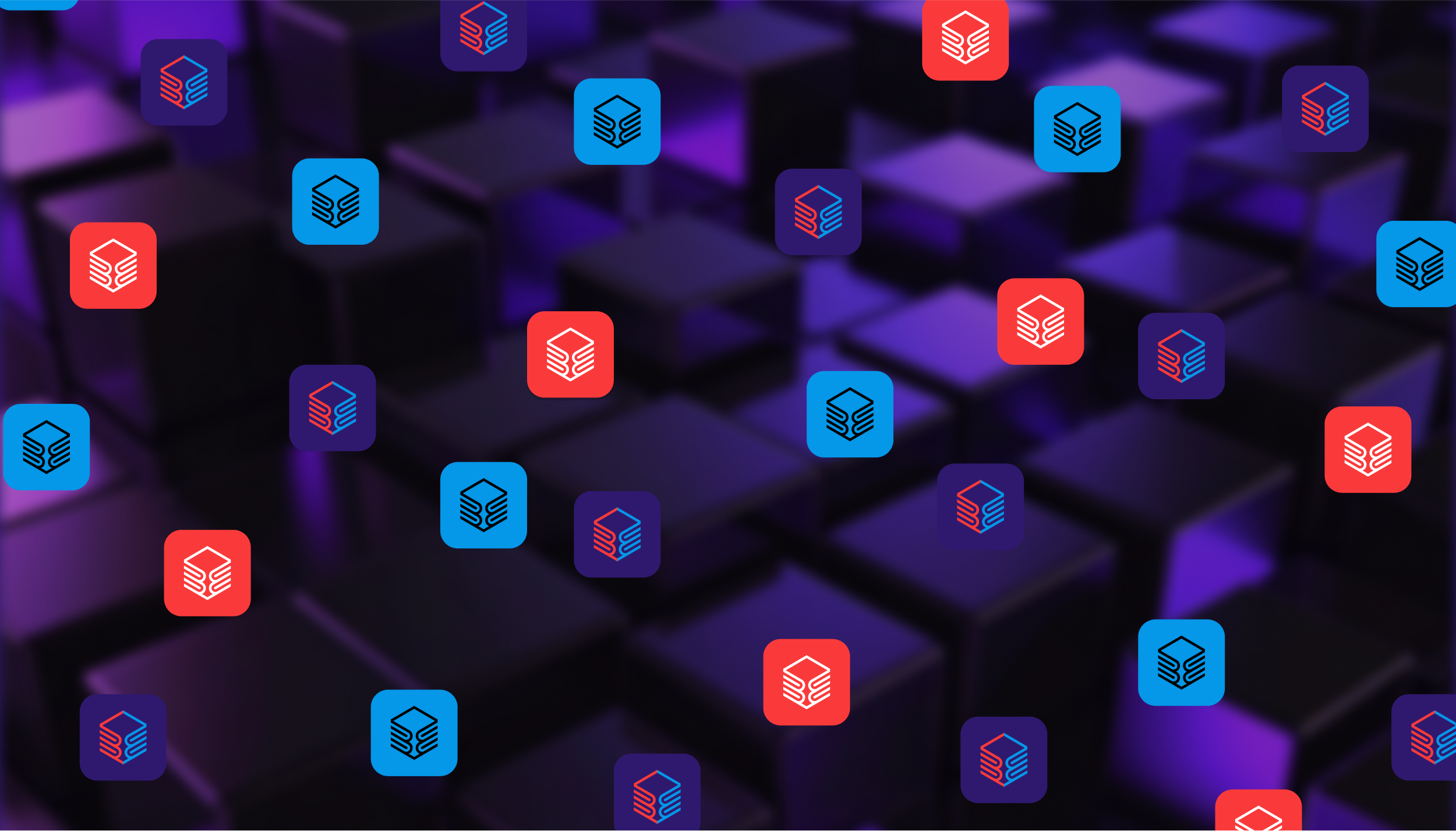
Colour Bloc
A combination of colour groups sharing a common purpose.
To reflect the connection between medical and digital themes, I developed two distinct colour palettes that work together as one system. The palettes are linked through red and blue, two core colours that sit at the center of the brand’s identity.
These two colours were carefully selected to share the same tonal value. When converted to greyscale, they appear as the same shade of grey, reinforcing the idea of unity across the colour groups. This subtle alignment helps visually connect the palettes while still allowing each one to speak to its own theme: red carrying the urgency and warmth of medical care, and blue representing trust, technology, and precision.

Brand Exploration
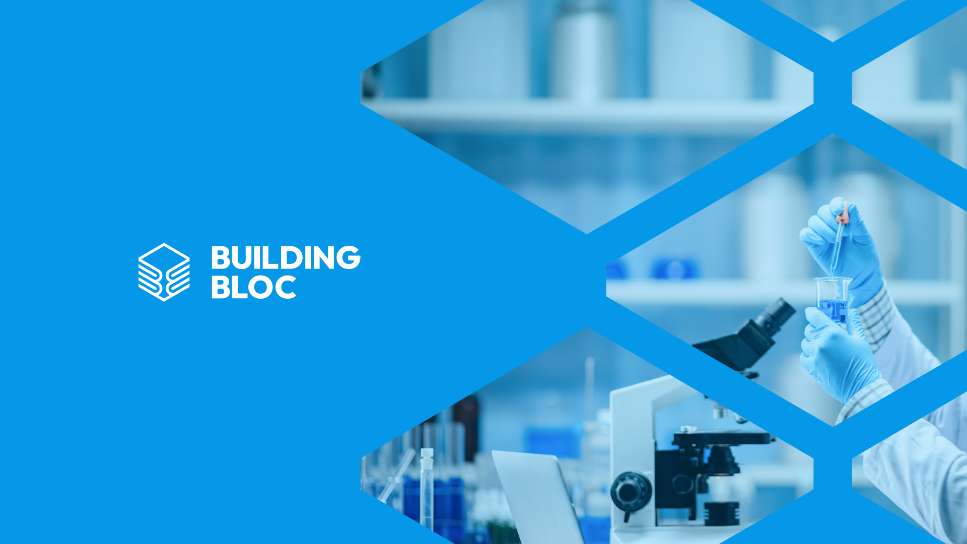
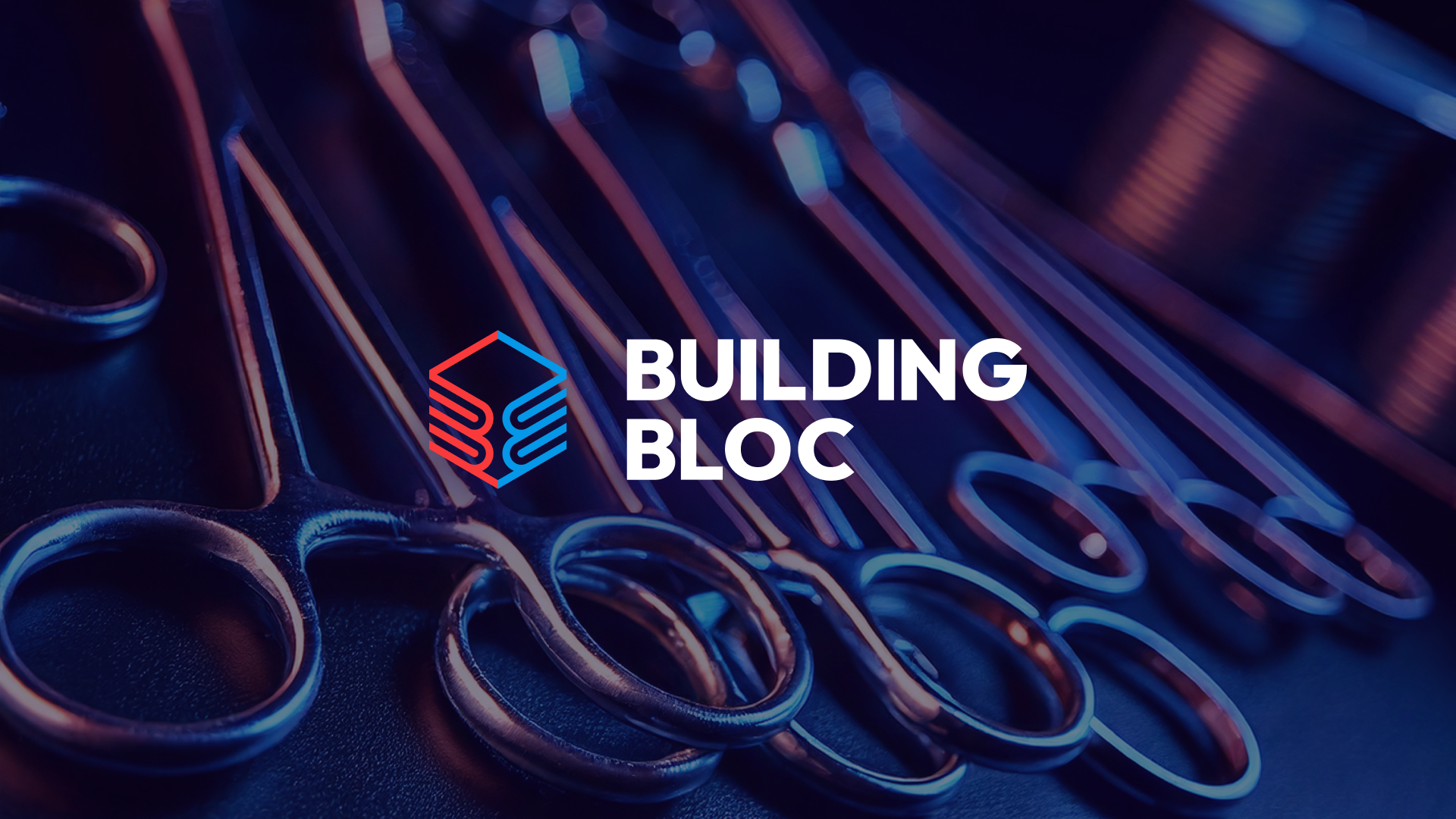
While this wasn’t a full brand identity project, I wanted to explore how the logo system could adapt across different visual directions. The brand currently has a dual personality, shaped by its two colour blocs, one rooted in the medical space, the other more digital and futuristic.
Through merchandise mockups and various use cases, I’ve shown how the brand can lean in different directions depending on what the company chooses to emphasize. In one direction, we see a more clinical, lab-focused identity. In the other, a sleek, digital-forward tone. And in the middle, there’s potential for the two to blend, like the surgical tools rendered with a high-tech, almost sci-fi feel.
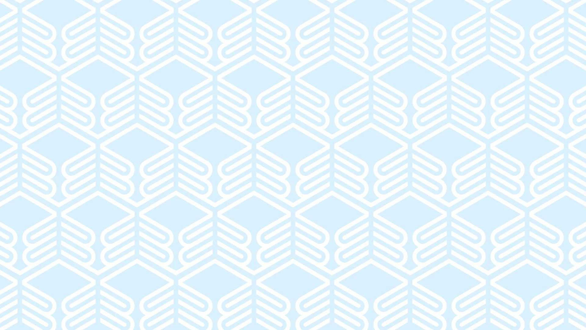
The two colour groups are intentionally distinct but designed to work together, leaving room for the brand to grow into either space or unify them further over time. I also introduced a modular grid pattern using the logo mark, offering a flexible system for building out future brand elements, from packaging to digital platforms.